Detroit Institute of Arts
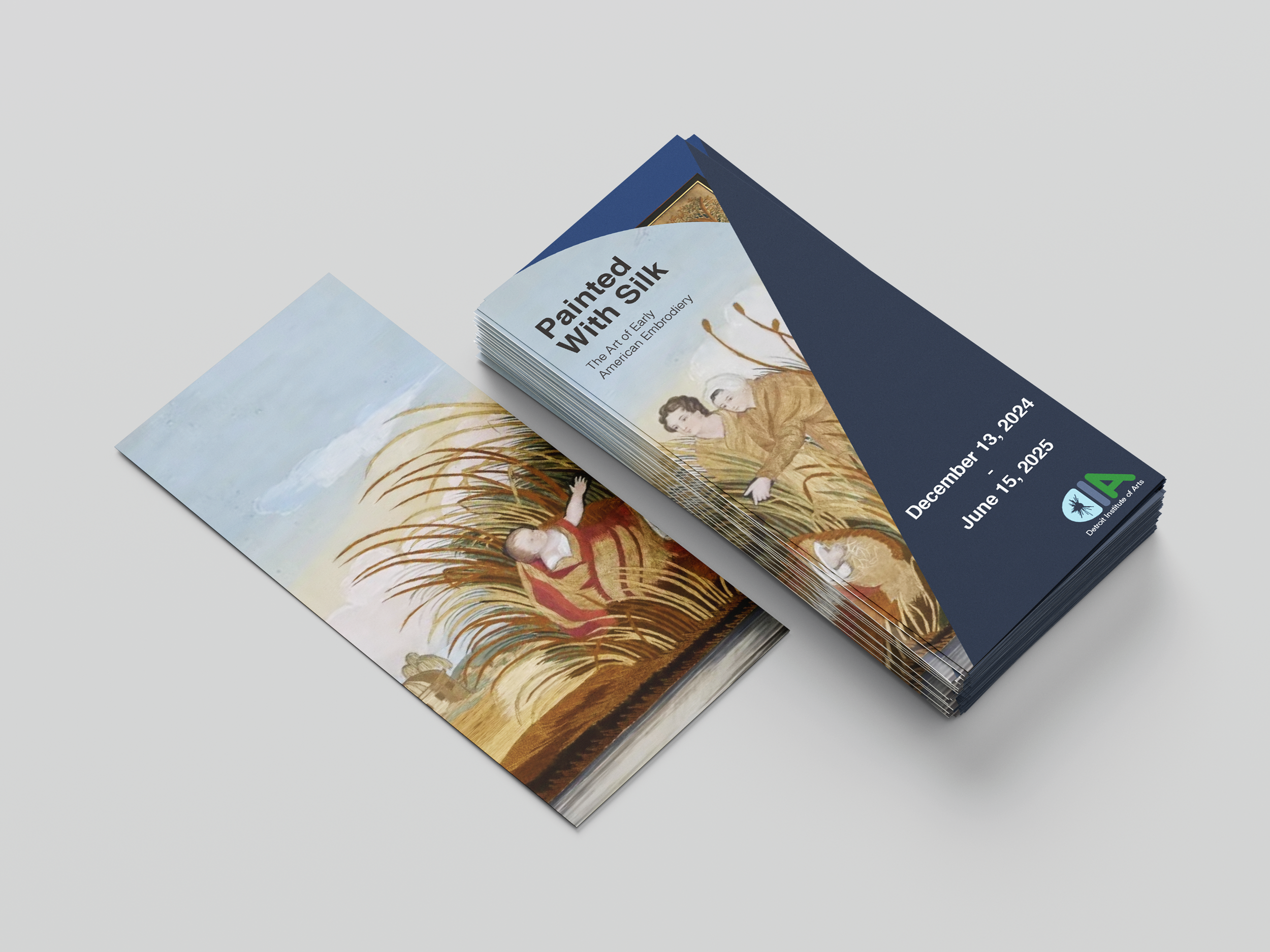
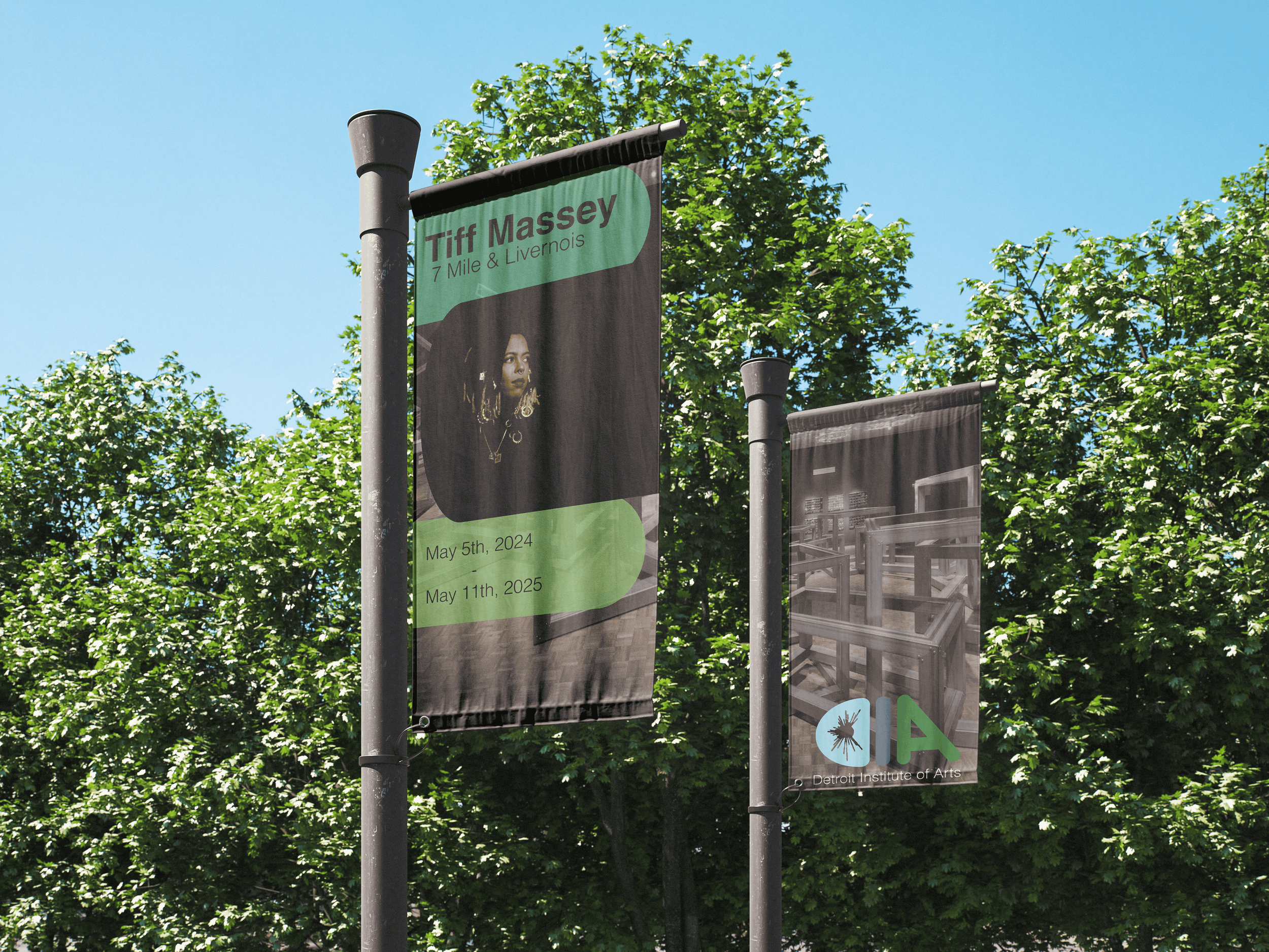
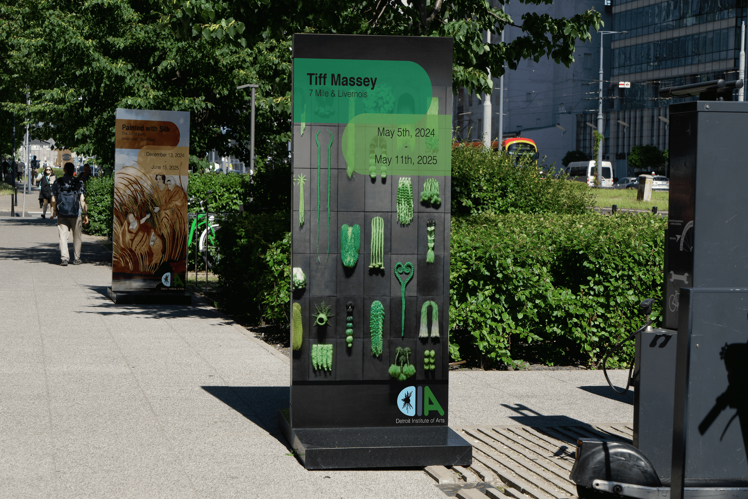
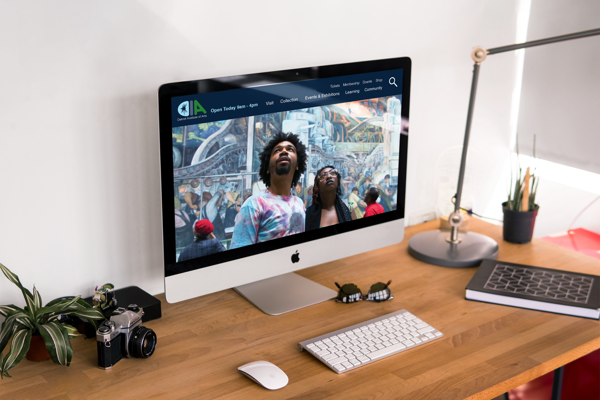
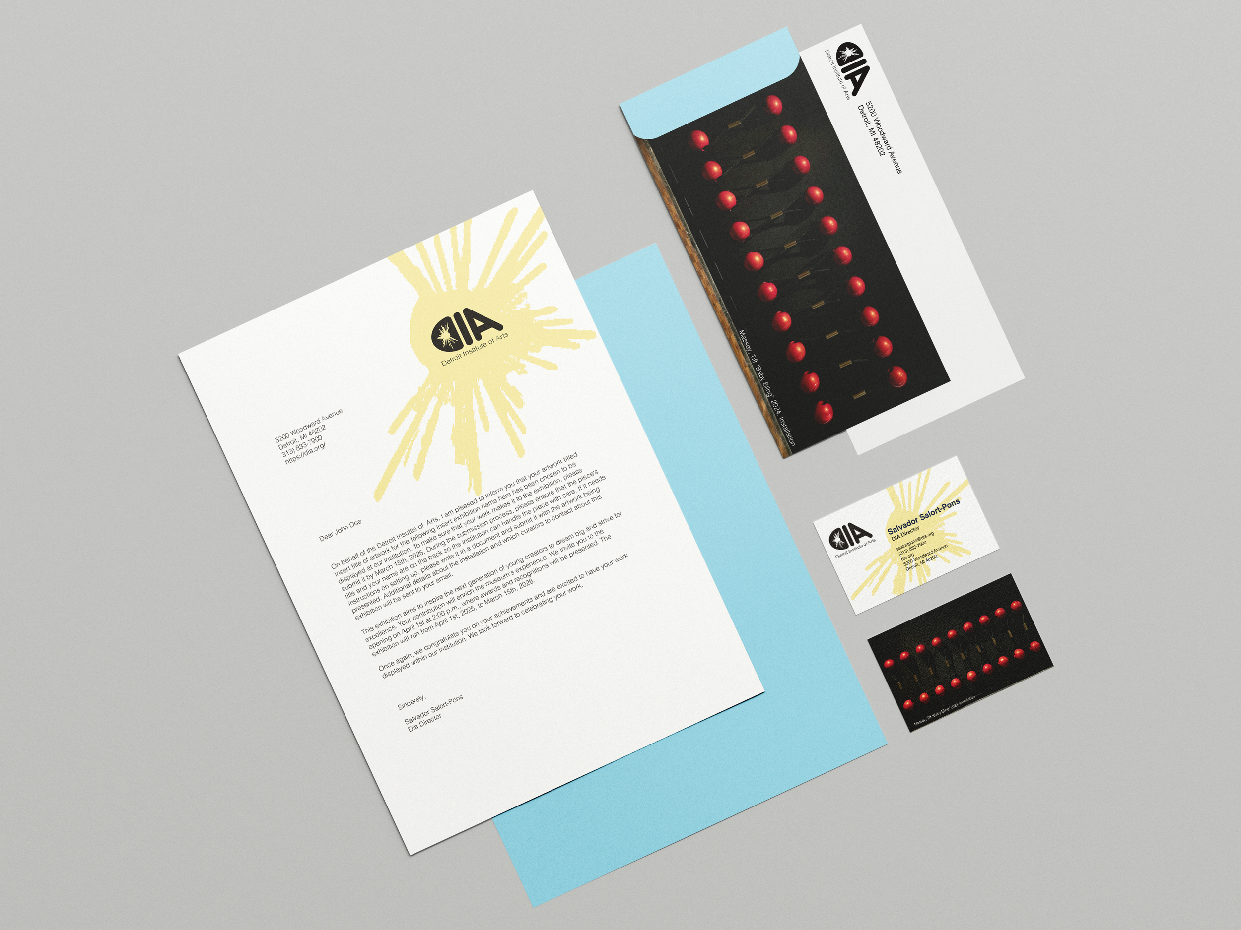
Rebranding of the DIA that is more focused on community engagement with the tri-county agreement with the museum. The rebranding is not affiliated with the museum. The colors reflected in the logo and across branding align with the primary colors used by Macomb, Wayne, and Oakland counties on their websites. The colors align with the tri-county agreement that the museum has, which is centered on the community. The stationery set and other touchpoints focus on the exhibitions at the time, using photography from the shows to promote the current exhibitions. The photography includes the community engaging with the museum.